Hey, there! Here comes another tutorial, again for starters. In case you already know how to achieve the most realistic look for your digital paintings (color picking/mixing in particular), then the following tutorial might be boring for you.
As I'm still new to painting digitally (basically started about a year ago), most of the experiences I've been making the past months don't provide much content for advanced tutorials. Though I am sure that I will get there soon enough. ;)
Coloring: Mixing While Painting
This tutorial focuses on color choices, mostly on why mixing colors (while painting) is better than picking a "finished" tone. You might have learned that in school already, that with some paints, it's better to mix on the canvas instead of separately on another surface. This for example works to a certain extent with crayons/coloring pencils and water-based paints. Mixing your colors "outside" your painting does work too and is not wrong, this definitely depends on your personal taste. But "mixing while painting" creates a more natural, a more lively look. (I talked about that in
my last post along with some useful tutorials, I recommend you look that up!)
With digital painting, it's no different. Although with the large range of colors and the option to pick the exact color you want without much effort, digital painting makes things a lot easier and shortens the coloring process. But it makes things look surreal, sometimes even dead. That's the case with skin, for example, or anything else "organic" as fur or even plants. Even though these things seem to be made out of one, max. three colors, there're a lot more colors to it than you notice at first glance.
The first thing we see when looking at a leaf is that it's green. Well, there's more than one shade of green, even in the color mixer. Sure there is, but why are they different from another? If they're all green, why does one look different than the other?
Looking at it from the artist's view (since that's what we are or aspiring to become), green isn't just green. It's -as we have once learned in school- a mixture of yellow and blue. And that's actually all that we need to know. Since yellow and blue are the key colors to achieve green, we can also figure out how to achieve those different shades of green: By changing the intensity or shade of one of the two colors, we can create countless different shades of green. One benefit of this is that we can create an unique shade of a certain color.
Another benefit of this method is that we can control the intensity of a color. That might sound weird but yes, that's how it works. And that works if we play with the opacity, flow and -depending on your software- blending. Logically, if you paint yellow at full opacity over blue, there will be no green but yellow instead. If you lower the opacity (and flow also), then paint over a blue spot, you'll have green or teal, depending on the opacity or pressure. The higher the opacity of your yellow, the brighter the green gets, which helps to make a nice spring or grass green. The lower the opacity, the more blue will remain which makes the green darker.
Instead of blue though, you can also play around with different shades of yellow, maybe even orange and use a dark shade of either of the two colors added to some green color to create an unique dark green hue. Red works too, that depends on your preferences or what you want to achieve with your painting! It also works to pick a greenish yellow and use some kind of reddish brown and finish this up with some picked green shade overlaying with low opacity/flow. There're a lot of different options and it takes a lot of time and effort experimenting with each of them to find out which one fits best to your coloring style (or painting).
While green is a rather simple shade to figure out and pick apart, there're more complex colors that you one day end up using on a picture. I guess the best example for that is skin. It looks so easy, doesn't it? When I was little, I used to take an orange crayon before I got a skin color one or mix orange paint with white before we learned how to mix skin color properly. While using orange as main color and changing its intensity works too, mixing skin color is the optimal solution. Other than with fabric, we want skin to look "lively" and healthy because that's what it should be. But how to figure out the right colors? Well, one way is to look up color schemes on the Internet which is definitely no crime and helps a lot in the beginning. The best way is to figure it out yourself (I chose way 1 too at first but a short while ago I started relying on my own observations).
The best way for me to find out the right colors is to look at the object in sunlight or in this case, look at my own skin (I hope all of you have skin otherwise this might be a great excuse to stare at people in public). And not just look at it but examine it. Let's choose the hand as our object for this. First question - does it really look that orange to you? Like a mixture of orange and white? Probably not (if it does, that could be unhealthy or you're an alien, I don't know). When you look at the parts of your hand that lie in the shadow, what colors do those parts have? I guess it's some shade of red, right? Same goes for the lines on your palm, they're more red than orange and that's the point. Red is an important color for mixing skin color, even if there's no pure red, its relatives purple or even orange play a role in the mixing. Look at it with red as the core color and not orange, at least for me that point of view makes it easier to understand skin color.
But enough with the bashing, orange does have its importance in this too. Since the brighter shades of the redder orange are similar to skin color, they work great as base color. By changing the opacity/flow/blending again, you can apply the other shades and create the perfect mixture for your skin. Red works great for the darker parts of the skin, in some cases purple helps to darken them a little more. That as well is something you have to figure out yourself or find help in a skin color map. (I'm not saying that orange is wrong, it's just not purely and entirely orange that makes skin look like skin.)
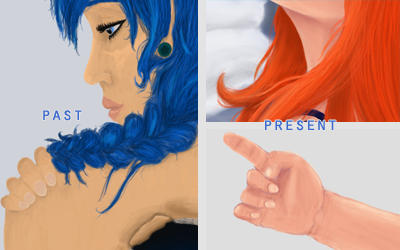 |
Left side: Painting from a year ago, I used different shades of pale and dark "skin color orange"
Right side: Properly shaded skin. This the method mentioned above and also in the other post |
What I'm trying to get at is that painting with a picked up, "completed" color ruins the realism of a painting in most cases. (Yes, it's okay with some coloring styles but those aren't the ones I'm referring to.) "Mixing while painting" helps to create authentic and realistic looks of mostly anything. Even when painting dead objects as clothes, when there's a pink dress, using red and white instead of picking a pink with the color picker creates an unique look. It takes a lot more time and a lot more effort but the result will be worth it.
To achieve this, as mentioned above several times, you need to play around with the opacity and flow functions of your software. These functions allow you to paint over a another color without painting it over but blending into it. Example: You have a blue spot, pick some shade of yellow, lower the opacity and flow and paint over the blue = green. Different values of these functions lead to different results, so in order to find out how low your opacity and how high your flow needs to be, you need to play around a bit.
Some software have additional options, i.e. PaintTool SAI also provides a "blending" function. This function is different from opacity and flow since it lets you to change how "much" the color is allowed to blend into the other. Example: Your green leaf needs only a tinge of yellow at the top? Change the value of the blending function and the yellow shade will melt into the green. (I really recommend using a software like SAI or some other software that focuses on painting.)
Here's an another example how much influence the color choice can have. I chose a yellow and a red shade, mixed them separately into three different hues of orange and with the help of the eyedropper tool, used them to color the carrot (left image). For the other example, I painted the carrot red first (opacity higher for the darker part, less pressure for the top part), then switched to yellow, changed the opacity and flow (lower) and painted over the red from top to bottom, changing opacity to a higher value towards the top again (right image). For highlights, the part where the light touches the carrot, I used pure white with very low opacity/flow, just to brighten the now "orange-y" yellow.
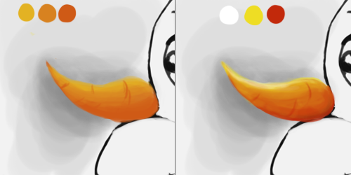
Spot the difference! On the left image the carrot looks unreal, still like a carrot but not very realistic while in the right image it looks exactly as it should - just from three completely different colors. With the different colors, you're able to create a better contrast and also a "shadow side" of the object without using black (or a very dark orange). You can use a yellow and a red shade closer to orange of course, as long as you can still identify them as yellow and red.
I hope I was able to explain this method of coloring properly and that you could at least understand the basics. I've been using this method for a while now on all of my recent pictures, the best example is the header above. Just like with the carrot, I made Chimchar's fur from yellow and red, Teddiursa's fur is a combination of different red-brown and orange-brown shades, highlighted with a vanilla yellow and smoothed with an orange shade. Also, that's how I do Chopper's fur: It's a mixture of brown and vanilla yellow with a tinge of orange (took me some time of staring at him to figure that out). You can see my earlier attempts at figuring out the best mixture for his fur below:
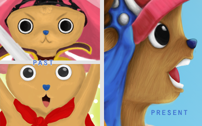
I made the same mistakes as with the other painting: I "mixed" the color in the color picker, picked out a brighter and a darker shade of the exact same color and went on with the painting. That makes the fur look like sand actually or even like mud depending on the intensity. Anyway, while it seems to be Chopper's fur color, it doesn't look like a living creature but instead like a doll. Sometimes only adding a different bright color with low opacity/flow to highlight a part is enough to create more "depth" or liveliness. (For example, I used a very shiny turquoise to highlight Chopper's post-timeskip hat, as seen in the blog's header above.)
So, that's all about this method/technique I can tell you about and I hope that some parts of this post could help you a little! There might be different and easier methods but the one mentioned in this post is the one that works best for me and is the most "logical" one to me.
In case there're any questions unanswered, new questions, concerns or anything else, feel free to comment!
...before I'll forget about it again: I was asked what kind of software I use. Currently, I'm working with Photoshop CS2 which is a pain the ass for many reasons but it works fine for now. I have experiences with SAI (and other Photoshop versions) and I recommend software that is more focused on painting than PS is. Some of them are even cheaper than PS (i.e. SAI is, or Clip Paint Studio).


